3. As simple as beautiful
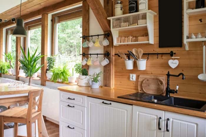
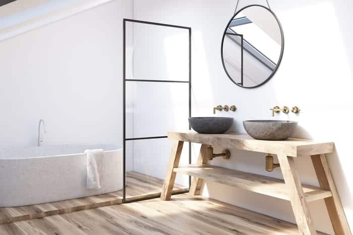
Instead of cluttering your space by too many objects, it's better to have a focal point. At photos of Joanna Gaines's designs, she always has one amazing piece of art that stands out. For example, she has a giant black clock on the wall in the living room. It contrasts with the white walls. Simple but bold, and it looks great.

Many people go over-the-top with their designs. They think "designer" or "fancy" means having a lot of stuff on their walls and countertops. But the truth is all about simplicity.
